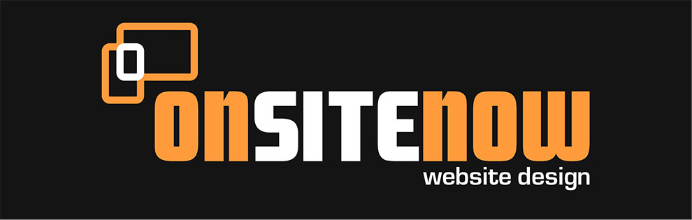
 I was set a brief to update and redesign a web designer’s company logo. I was required to stick to their flat design style and colour scheme. It was also important to incorporate their current logo symbol and make it work more effectively with the overall design. Their symbol consisted of basic outlines of three devices; phone, tablet and monitor, all of which were aligned inside to a common corner. Once my layout design and chosen fonts for the new logo were approved, I decided to put a bit of a twist on their symbol, rearrange and link the ‘devices’ on the outside of a common corner, rather than the inside. I then reordered their colours to give the ‘devices’ their own individuality, while at the same time being linked together as one symbol. It is simple and effective. I was inspired by the ‘web link’ icon, to which it has a loose connection to (excuse the pun), due to the way they are attached to one another.