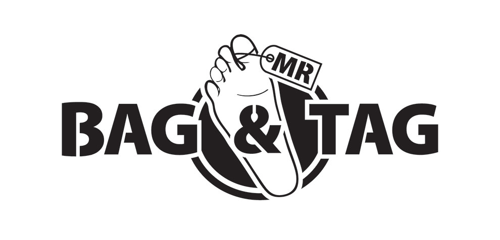
 Logo designed for MMA Fighter Mr Bag and Tag.
Mr Bag and Tag was focused on an idea of a body bag as his logo, but after discussions, we soon realised that it would not work very well visually for a logo design. So I decided to lend my attention to his name and what he wanted to get across. A tagged foot hanging out of a body bag was a strong and abrupt image and that is exactly what I incorporated in the design of his logo. I wanted something bold that would kick out (excuse the pun), catch his audience attention, and be easily read on camera. This is also the reason why I chose a nice big bold font, with slices in the letters, mimicking the way I cut out the circle within a circle in the background and also the way I put the whole logo together.
New website looks really good
Cheers Mate!